Visualizing Your Professional Network
Category:Infosec Communicator,Social Networking,STC,STC RochesterDid you know that LinkedIn Labs provides a graphical representation of your professional network? It’s similar to a hyperbolic browser I saw demonstrated several years ago in a research facility in Silicon Valley. The map allows you to hover over each point and provides a popup of your connection. After spending last week at the STC Summit conference and adding many contacts to LinkedIn, I thought it would be fun to take a look.
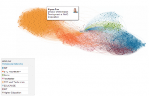
Here’s a picture of my network, highlighting one of my favorite connections. You’ll note that the connections are clustered in several different groups, representing my involvement in two professional organizations, higher education, and the corporate world.
LinkedIn provides a short video overview of the connections map.
Do you find this type of graphical representation useful? Why or why not?


